 Grab my guide to the 10 main ways to grow traffic and optimize to boost sales.

After ten years in the web design business, I’m taking a turn being the client. I’m taking our lessons to heart and getting out of my designer’s way by sticking to our guidelines.
After being involved in hundreds of design projects, this is about as insider-y as logo design tips get, so read on to get some knowledge you can use when it’s your turn to hire a designer.
Mariah on our team has finished up the new logo for Aeolidia, and Sarah is now hard at work on the website design. Here is what made the logo project a smashing success.
What I did differently
From experience, I know that if I don’t hear from an Aeolidia designer for a few days, she’s not off eating croissants somewhere. She’s hard at work thinking over ideas and perfecting things. With no particular deadline, instead of keeping to a schedule, I’ve been trusting the process and allowing it to take all the time it needs to. After ten years, this redesign feels like “the one” – an identity we can stick with for a long time.
I would hate to think that we hadn’t fully explored options, and perhaps ended up with something that wasn’t all that it could have been given more time.
While I don’t recommend that you necessarily take this lackadaisical approach, I do think that trying to rush a logo in two weeks may be shortchanging yourself.
The design brief
Here are some bits from my “design brief” that I sent to Mariah so she could start work on the new logo.
Merman:
I am willing to see it with or without the merman (or a new or adjusted merman). I am leaning towards keeping him in the branding somewhere and somehow, but, while I love him dearly, I am also open to throwing him out. Since I’ve never approached our branding purposefully, I don’t want to tie our hands by insisting on something that just kind of “happened” to Aeolidia.
Company identity:
You know all this, but Aeolidia is fun and friendly place to work with expert-type people (who will end up feeling like friends) on your creative small business. Mostly to develop a web presence, but for all the other bits and bobs that support that goal. We are professional, punctual, and very client-oriented.
Target customer:
Easy! Our target customer came up with a crazy idea of a product that she wanted to make, and maybe enlisted a friend to help out, and has been spreading the word about their little business ever since! She values her own hard work, believes in what she does, is willing to invest money when it makes sense, knows when to delegate tasks, wants to increase awareness and sales without getting too big, and has a fun time doing it all!
She shops local and small internet businesses herself, pins design inspiration on Pinterest, frequents craft fairs, and has an appreciation for things indie, quirky, silly, upbeat. She is optimistic, open, and friendly, feeling that similar businesses are more “colleagues” than “competitors.”
Initial design concepts
These were the first ideas that Mariah prepared for me. If you click the image below, you’ll be taken to a fun newsletter I sent out to my subscribers showing all the great ideas, and why they didn’t make the cut.
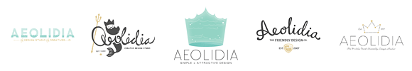
The one not included in the newsletter is the one that we followed down the path to become our new logo, and you can see its first look here:
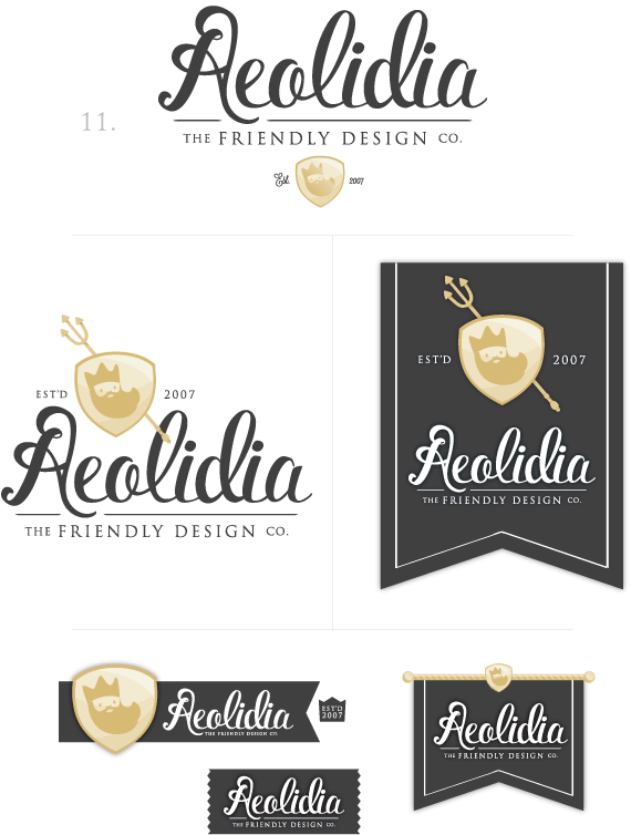
I shared the following thoughts with Mariah, and we moved forward to make it just right:
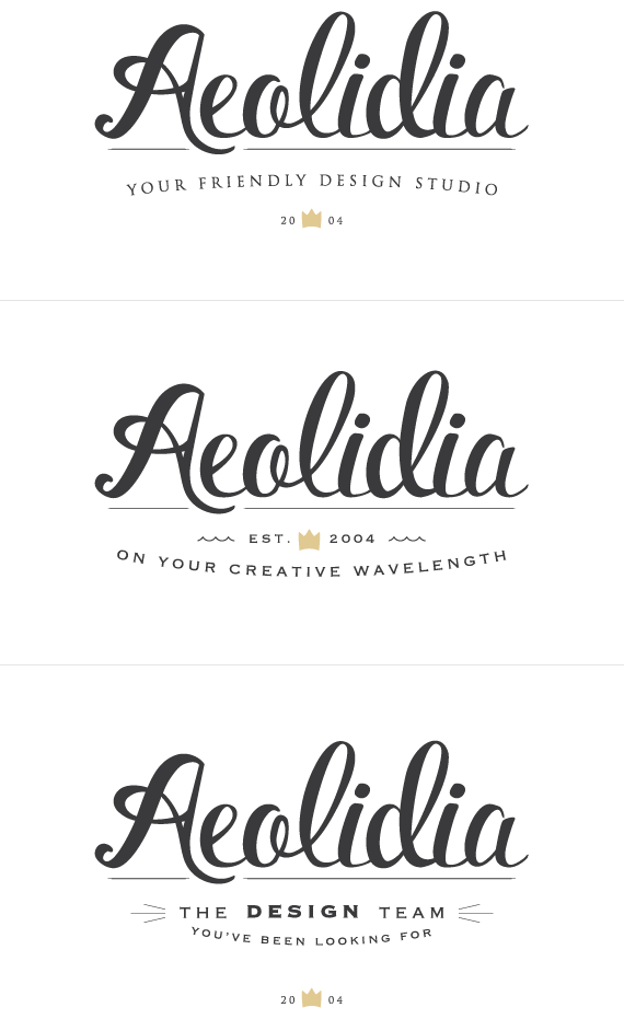
This one is the winner:
- I love how tidy it is
- I love how the script can be read as either feminine or masculine and manages to look both sophisticated and friendly
- I love how the ‘e’ nests in the ‘A’ and how the ‘A’ dips into the line
- I like how the ‘A’ stands tall and confident and the flourishiness that classes the joint up
- Now that I see it all, I’m pretty sure I do want to keep the merman to some extent (if not directly in the logo, then as a graphic element)
Now, concerns:
- It seems so formal and luxurious! I don’t know if we are this luxurious! I keep thinking “luxury cigar brand” or “exclusive jewelry company.” Do you think this counteracts the “friendliness?” Do we look too expensive?
- Shoshanna pointed out that our merman just looks like a lumberjack king when he’s placed with no cues about the sea. So, for instance, if I show the logo anywhere with just the shield and head, you lose that oceanic info about him.
- I like the idea of a flourishy ‘A’ but these particular flourishes I’m not sure about. The top is maybe too bulgy? It’s kind of giving me a “backwards R” vibe at the top.
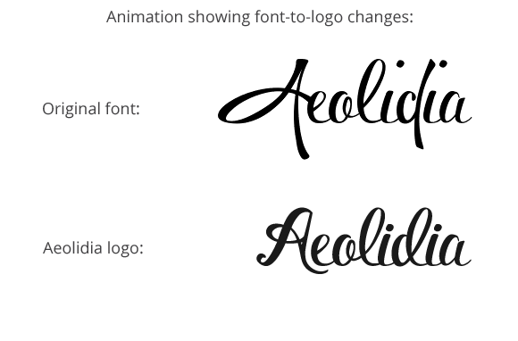
Developing the logo
Adjustments were made to the logotype itself for the initial idea, and then Mariah worked on color schemes, illustrations, patterns, and stationery. You can see how she adjusted an existing typeface to make it something custom to us:
We tested out some taglines:
We worked on patterns and graphics (a future post on our blog will explore those), and Mariah got everything just right.
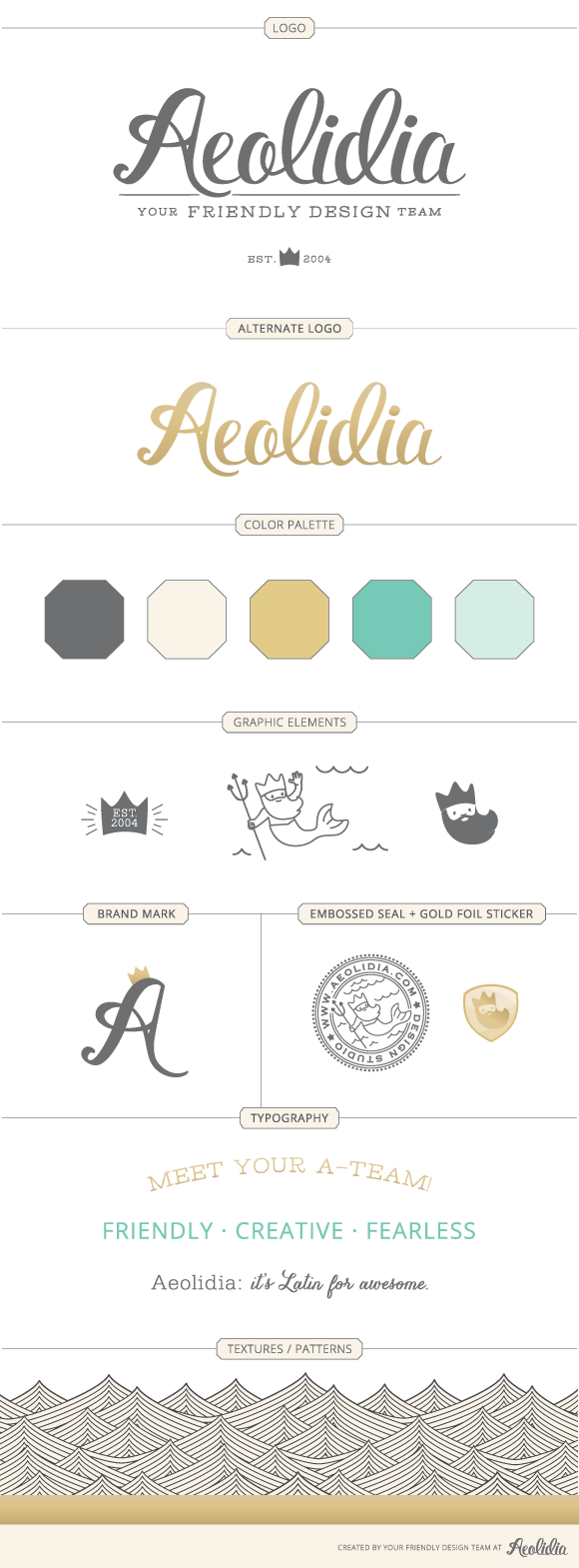
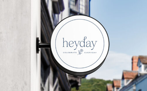
Final Aeolidia brand identity
We ended up with this beauty, which I can’t stop gazing at adoringly:
Lessons learned from past projects
1. Do the homework first. Before plopping a pile of information on Mariah, I thought hard about our business. How things have changed since we started, what we’re like now, and what our clients are looking for.
2. Consider the client above all. When giving my design preferences, I thought of what our clients like and what they’re looking for. It’s tempting to ask your designer to design something just for you, but resist! If your business is a good fit for you, you’ll find that you and your target customer have similar tastes. For the Aeolidia redesign, while I love cute things myself, we decreased cuteness and aimed for a more grown-up look.
3. Keep preliminary information broad. I wanted to see what Mariah’s beautiful creative mind could come up with, so rather than telling her just exactly what I wanted (e.g. a seahorse icon and Archer font in blue and orange), I instead discussed Aeolidia’s overall vibe, target client, and general design preferences, leaving Mariah free to create.
4. Keep an open mind. Even if you’ve handed the reins over to a designer, it’s hard not to have at least a vague picture of your new logo in your mind. When I saw Mariah’s first design ideas, I tried to clear my mind of preconceived notions and evaluate each one as a valid possibility.
5. Don’t give prescriptive feedback. We’ve found over the years that projects go much better when clients focus on being clear about what they do and don’t like, rather than trying to think of ways to “fix” what they don’t like. For instance, insisting on a specific font, color, or placement of an element can tie your designer’s hands and make it so she can’t use her years of experience to come up with a better, creative solution for you. We also ask clients to relate their criticisms back to their original goals, so we can be sure adjustments aren’t arbitrary.
How do you like us?
How do you like our new look? Do you feel like it matches better with the loveliness in our portfolio? Follow along on our progress by joining our mailing list and checking out the Aeolidia redesign posts on our blog. I have a post coming up that will show how our indecision on choosing a pattern led to something we love. I can’t wait to show you everything!
P.S. if you’d like to have this much thought and care put into your new logo, please contact me to begin the discussion.
(originally posted on Oh My! Handmade)
Could You Use Actionable Tips to Improve Your Sales?

Our weekly newsletter will give you the tools and info to drive traffic to your site, promote your products, and grow your business. You'll get the following:
- A week of our best-ever business-growing information
- Weekly tips to help you market and sell your products
- Access to our community of creative shop owners
- Arianne’s personal attention as you grow your business
Browse Posts
Newsletter Sign Up
We write a new email each week to help you grow your business.
1 thought on “Logo Design Tips: Allowing Your Designer to Shine”
Leave a Comment

Let's take your online shop to the next level
The Shopify websites we design have a reputation for substantial improvements to ecommerce conversion rates and online sales. Let's talk!
Awesome tips. All the ideas that you shared for us are very informative and helpful about logo design. Thanks